
Jon Sumanik-Leary
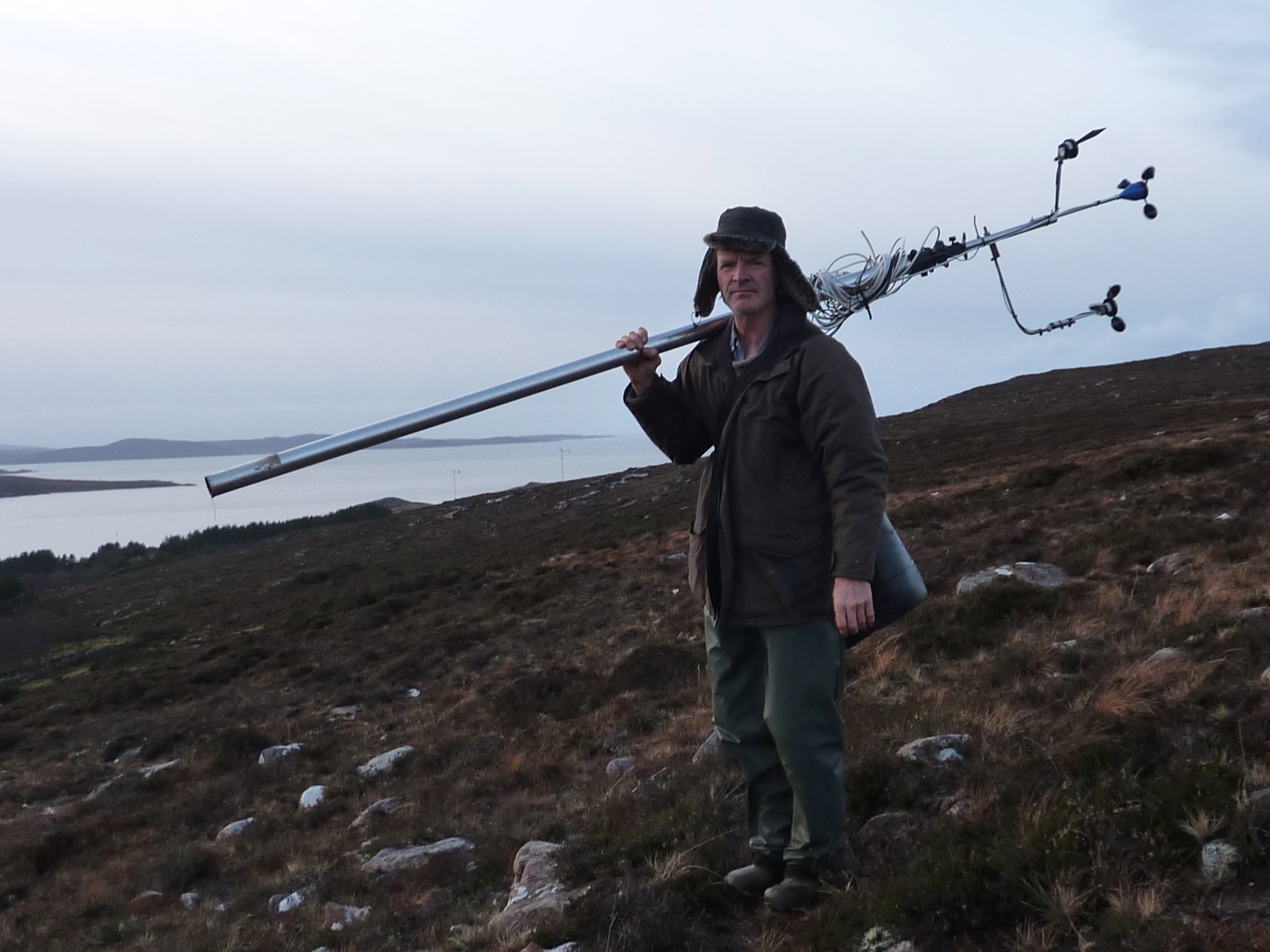
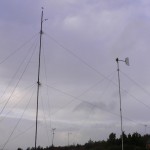
Hugh with a portable telescopic wind measurement mast.
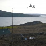
Between 2012 and 2014 Jon Sumanik-Leary and I did some performance measurements on wind turbines here at Scoraig, using Logic Energy mobile logging systems. Jon has finally completed the processing of the results and sent me some exciting curves. I have split the data charts into a series of categories with some discussion of each category.
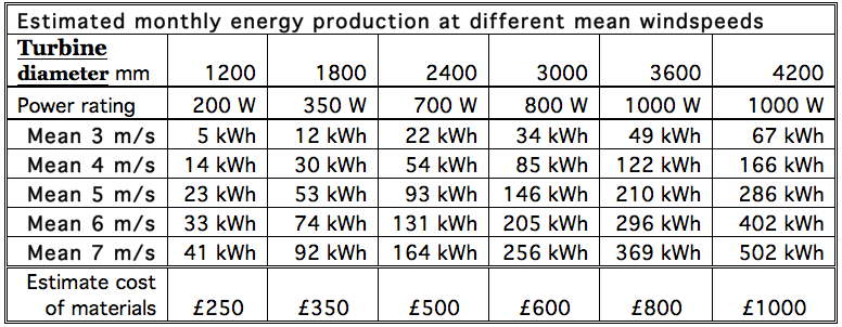
I have adopted a simpler naming system, still based on rotor diameter. Instead of “2400 mm diameter NdFeB magnet Recipe Book design” I will write 2.4N.
The 2F is one of my new range of ferrite magnet designs, with 2 metre diameter (one metre long blades).
Sometimes people think the big number is Watts, which is an embarrassing mistake. I am not among those who claim kilowatts of power from tiny turbines. I am more interested in real world outputs in real world everyday windspeeds.
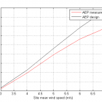
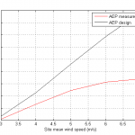
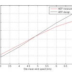
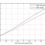
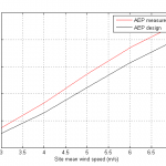
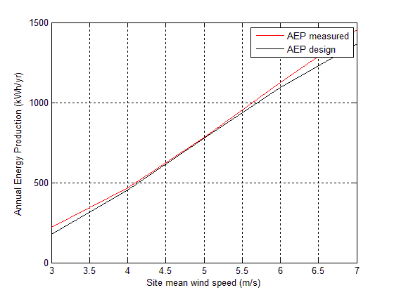
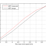
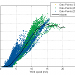
The first set of charts show Annual energy production of turbines – measured versus predicted in the Recipe Book. Energy is measured in the same kWh units used in utility bills.
Annual energy production (versus annual mean windspeed) is the “bottom line” for any wind turbine. The red lines are the predicted annual energy production in kWh of electrical energy based on measured power performance on site, and the black ones are based on the (monthly) prediction data that I published on page 4 of my Recipe Book (and below).
-
- 2.4N 24 V Aggie
-
- 2.4N 12 V “jerry rigged” experiment
-
- 3N 24 V at Achmore
-
- 3N 24 V Nigel’s
-
- 2.4N 24 V Nuala
-
- 2F 12 V
-
- 1.8N 12 V
-
- 2.4N 48 V
Two of the turbines are pretty much on the line, two exceed expectations and four of them fall short. The worst one is not actually built to the Recipe in fact. I was being told that I had to try this “much better” stator connection, sometimes called “Jerry rigged” or “Independently Rectified Coils”. I have now tried it and it’s not good. Also this turbine had the tail shortened to deliberately reduce its output in high winds.
 Overall I am fairly happy with the accuracy of my predictions in the Recipe Book (above). Results do vary. Often it may be hard to point to the exact reason. 12 V systems are inherently less efficient, and this shows up in the data to an extent. But the new 2F design did OK in spite of this handicap. Aggie’s turbine has a very long cable and being a 2007 built machine before the Recipe Book was written it has a smaller than optimum tail vane.
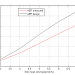
Others have done performance testing. Here is a link to a test program in Holland with annual energy production figures close to but slightly under my Recipe book values. Kostas did a performance test on a 2.4 m turbine in Greece which produced a curve similar to the 48V Lee one here, exceeding my Recipe prediction.
A testing centre in France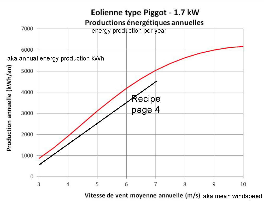 produced a curve above the Recipe predictions for a 3.6 metre diameter turbine (in red see right). This was a fully equipped wind turbine test site, unlike the results shown above which were all done using very basic methods.
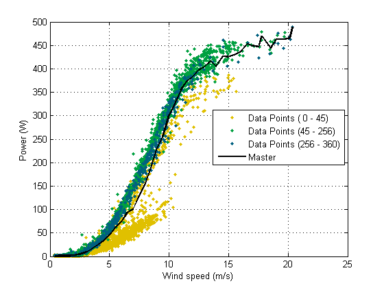
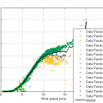
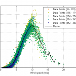
The next set of curves are what is known as Power Curves that show the average output relative to average windspeed on a shorter timescale of ten minute averages rather than a whole year. Bear in mind these are not instant readings. Instant power will go a lot higher for a minute or so and higher still for gusts. These curves tend to peak at 4-500 watts rather than the advertised 7-800 watts that the machines achieve for shorter periods in rising winds. And in turbulent conditions you will see well over 1000 watts at times which is more of a nuisance than something to be excited about.
-
- 2.4N 24 V Aggie
-
- 2F 12 V
-
- 2.4N 12 V “Jerry rigged”
-
- 3N 24 V Achmore
-
- 3N 24 V Nigel
-
- 2.4N 24 V Nuala
-
- 1.8N 12 V Laurence
-
- 2.4N 48 V Lee
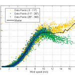
The plumes of colourful dots are individual ten minute averages, colour coded for wind direction. Clearly the furling works very differently in different wind directions on several sites. At first I put this down to the tower not being vertical. A leaning tower will distort the furling behaviour a bit. But this effect seems to remain even with perfectly plumbed towers, and appears to be related to slope and turbulence.
Some of these coloured data points are not allowable for power curve calculation and have not been included in the processing to arrive at annual energy (because their windspeed measurement is inaccurate) but they are still interesting to see, as they form some pretty wild shapes, and the power figures are real enough.
-
- 3N 24 V Nigel’s
-
- 2.4N 24 V Nuala’s
-
- 2.4N 48 V Lee
-
- 1.8N 12 V
-
- 3N 24 V Achmore
-
- 2.4N 24 V Aggie’s
-
- 2F 12V
The simplest way to compare the power curves of the various turbines is in terms of watts per square metre of swept area. This accounts for their size and creates a level playing field. Here are a couple of charts showing the various power curves in this form.
| Diameter | Area |
| 1.8 m | 2.5 sqm |
| 2.0 m | 3.1 sqm |
| 2.4 m | 4.5 sqm |
| 3.0 m | 7.1 sqm |
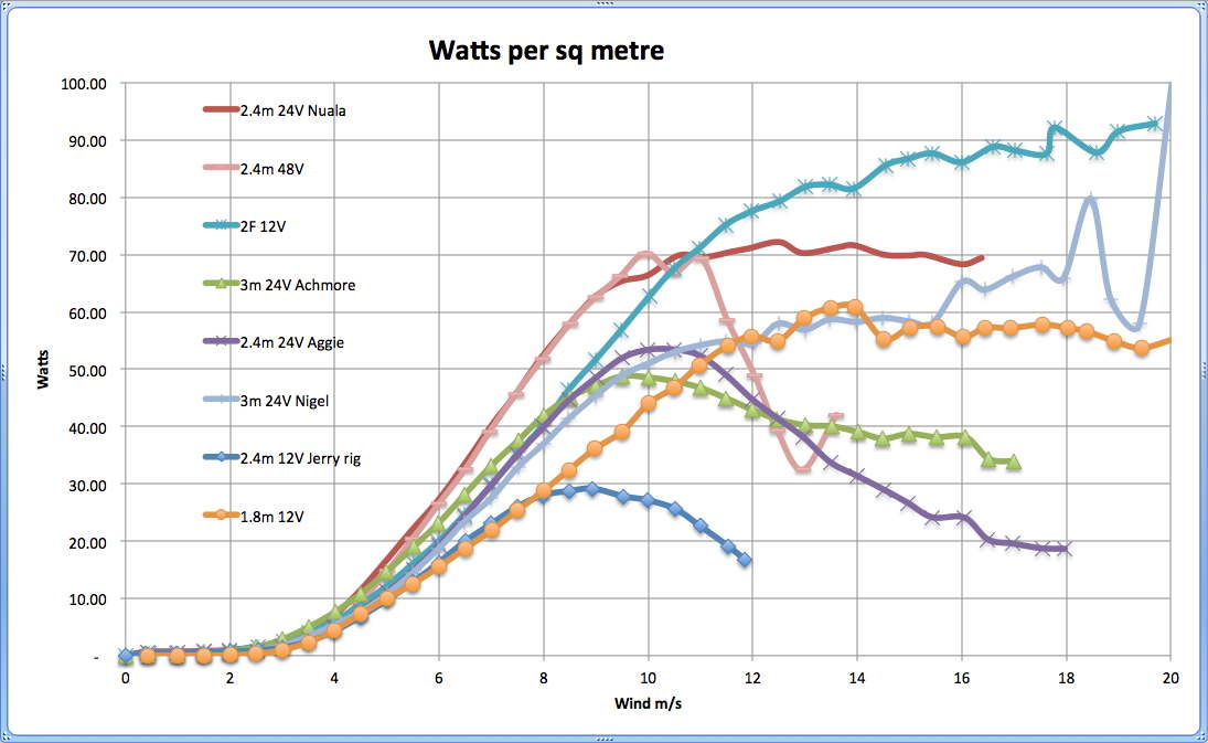
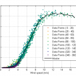
Furling behaviour of the various turbines compared
The efficiency (or “Power Coefficient”) can be compared in these curves. In theory it should be possible to obtain the “Betz limit” Cp = 59% of the actual energy passing through the blade rotor, but in reality around 20% is more typical. The next chart shows a zoom in on the lower windspeeds and you can see curves for 15 and 20% Cp.

Looking at the efficiency in everyday windspeeds